By Greg Mellen
When Luci Coppola first arrived on the campus of Bridges Community Day High School, where she is the Principal of the school and its Adult Transition Program (ATP), she noticed it had no colors, logos, or brand identity.
Unlike traditional high schools, Bridges and ATP specialize in serving students with special needs. As a result, little thought had been given in the past to those kinds of visual identity cues. However, Coppola said when she broached the idea of creating a brand for the school and adult program, the district was receptive.
Coppola quickly formed a branding committee with veteran teachers and staff to “highlight the history and accomplishments of the school.”
The school also gave students the chance to pitch in with ideas and suggestions.
After several rounds of votes and discussion, the committee settled on a mascot of sorts for the ATP, whose students are now the Explorers.
“We thought Explorers embodied their experiences in the community and in (post-secondary) classes,” Coppola said.
“We realized everything we did was about exploring,” she said, whether it was new ideas in school, new skills in the upgraded culinary lab, or discovering nature’s cycles in the school’s garden.
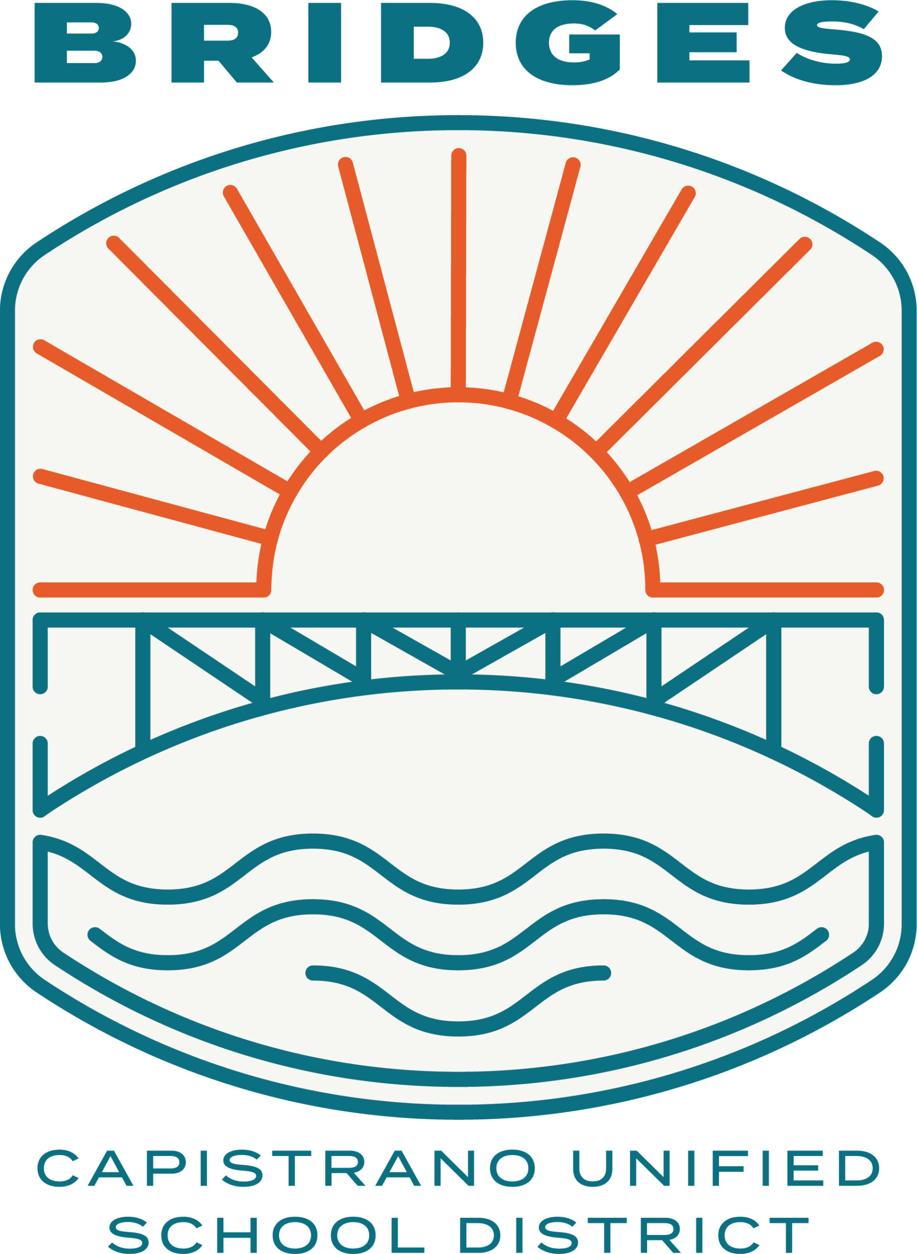
For Bridges, it was decided that the concept of a “bridge” already told the story about the school and its connections to the community and education. To supply the new look, Coppola turned to local designer Ryan Hayes to update logos for the two programs.

Hayes, of Mission Viejo and designer for A Pretty Big Deal, has two kids in the CUSD with another on the way. He was delighted to have the chance to put his mark on the district.
“I was just excited to do it,” Hayes said. “I’ve never done schools.”
When he learned about the programs, he said he became more excited. That only grew after his first meeting with Coppola.
“She was big on collaboration with the students,” Hayes said. “I usually like to keep circles small, but in this case we went large and I totally love it.”
Hayes got a taste of student involvement when he had the opportunity to tour the school. He was approached by a student, Mariah, who had her own ideas about the project.
“She had heard what we were doing,” Coppola said. “She came up with a spreadsheet for school swag that we could sell.”
All he ever wanted to do
Hayes has more than 20 years as an e-commerce designer and branding artist.
“All I ever wanted to do was be a graphic artist,” Hayes said.
And although he went to art school and is “somewhat classically trained,” painting and sculpture were never his passion.
“I’m not a gallery guy,” he said.
In school, Hayes said, “I was teaching the professors how to use PhotoShop.”
As he met with Coppola and others, they came together on the concepts they wanted.
“For ATP we wanted to harness Capistrano as a backdrop,” Hayes said, “without going to obvious connections, such as the Mission.”
“We have this amazing location with views of amazing rolling hills, the sun and the ocean nearby,” Coppola said.
What emerged were a couple of clean, modern logos.
“We dug in and tried to bring cohesion (to the logos),” Hayes said. He wanted connective themes between the images without replicating the look. For ATP, a circular logo was created with a sun rising over green hills dominating the middle above the ocean.
“Because we’re in the community, we thought the natural features tied to the Explorer theme,” Coppola said.
Similarly, the Bridges logo, which is square, contains the sun over a bridge, which is the centerpiece, with the sea below.
“We thought the bridge defines the school,” Coppola said, adding that the waves below, which are gentler than the ATP logo, signify the therapeutic nurturing mission of Bridges. There are also versions of the logo in assorted layouts, such as horizontal or badge.

Hayes said with revisions and discussions it took over three months, rather than the usual six to eight weeks.
Hayes’ boutique company, A Pretty Big Deal Inc., is a play off a Larry David-ism Hayes likes: “pretty, pretty, pretty good.” He has designed everything from constantly evolving marketing campaigns, to branding strategy and design, down to the packaging.
Among Hayes’ clients are south county stalwarts such as Bubs Naturals, Nature’s Wisdom and the Perry Group.
Although no plans are set to formally unveil the logo and branding, although some staffers have notepads with the new look, Coppola said there have been discussions about holding a school event.
And then, of course, there’s Mariah’s idea for school swag. Key chains, pens, pencils, mouse pads, and backpacks may not be too far behind.


